
Hidden City was built around the idea of a secret world operating beneath the surface — a mysterious underground universe hidden in plain sight. The goal was to create a brand that immediately felt cinematic, futuristic, and slightly dangerous while still maintaining a premium retail presence.
The visual direction pulled inspiration from dystopian cityscapes, underground societies, cyberpunk lighting, layered typography, and high-contrast graphic systems. Every piece of the brand was designed to feel immersive, almost like stepping into a hidden world with its own rules, symbols, and visual language.
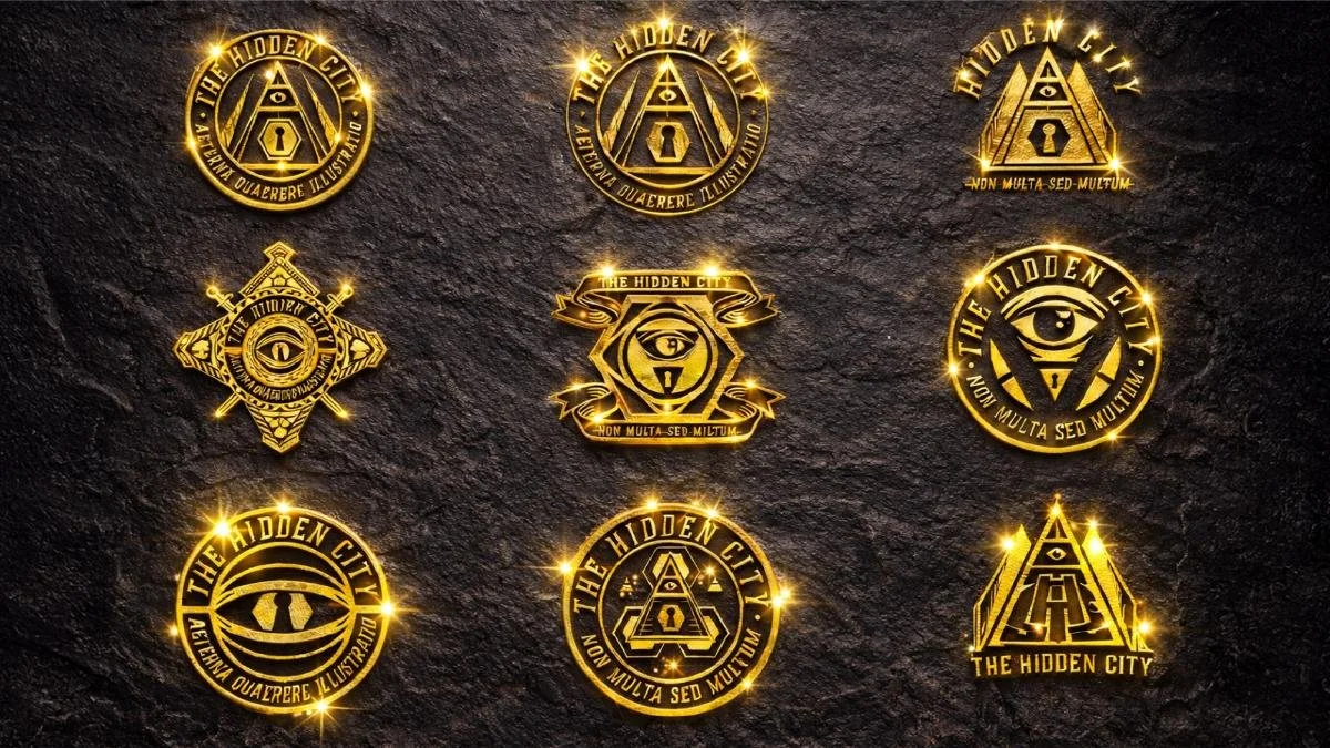
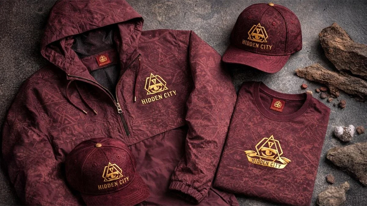
I led the creative direction and brand development from the ground up — building the identity system, packaging direction, graphic language, and production-ready implementation across multiple packaging formats and retail applications.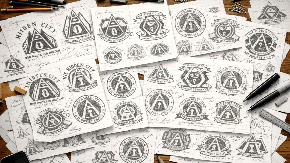
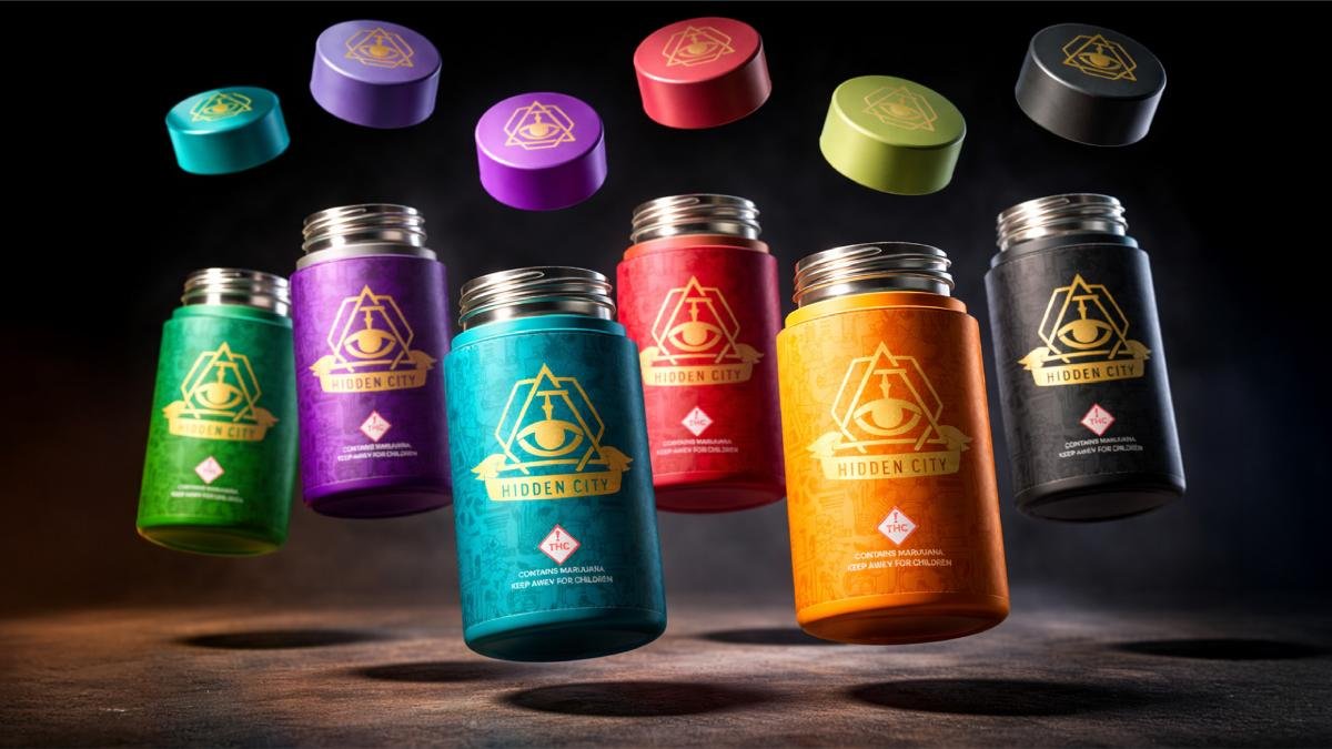
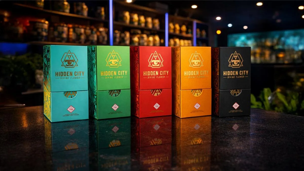
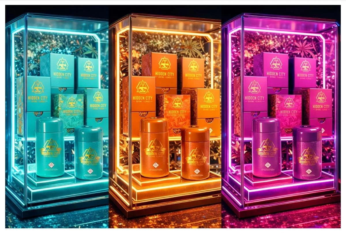
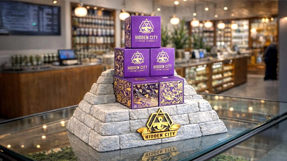
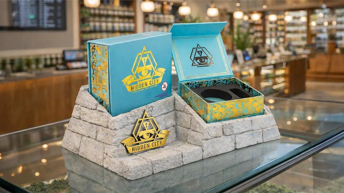
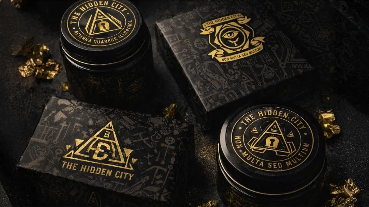
One of the biggest focuses throughout the project was creating artwork that not only looked visually striking online, but translated flawlessly into physical production. Every graphic element was engineered specifically for print applications, material finishes, and shelf presentation. Metallic substrates, specialty coatings, layered textures, and contrast-driven compositions were all strategically used to create depth and a premium tactile experience in-hand.
The brand system was intentionally designed to feel bold and instantly recognizable on shelves. Strong typography, glowing city-inspired visuals, and dark atmospheric compositions helped establish Hidden City as more than just packaging — it became a full visual universe.
From initial concept sketches through final production implementation, the project blended creative storytelling, technical packaging execution, and real-world manufacturing strategy into one cohesive system.
This project represents the type of work I love most — building brands that feel immersive, emotionally charged, and engineered for real-world execution from the very beginning.