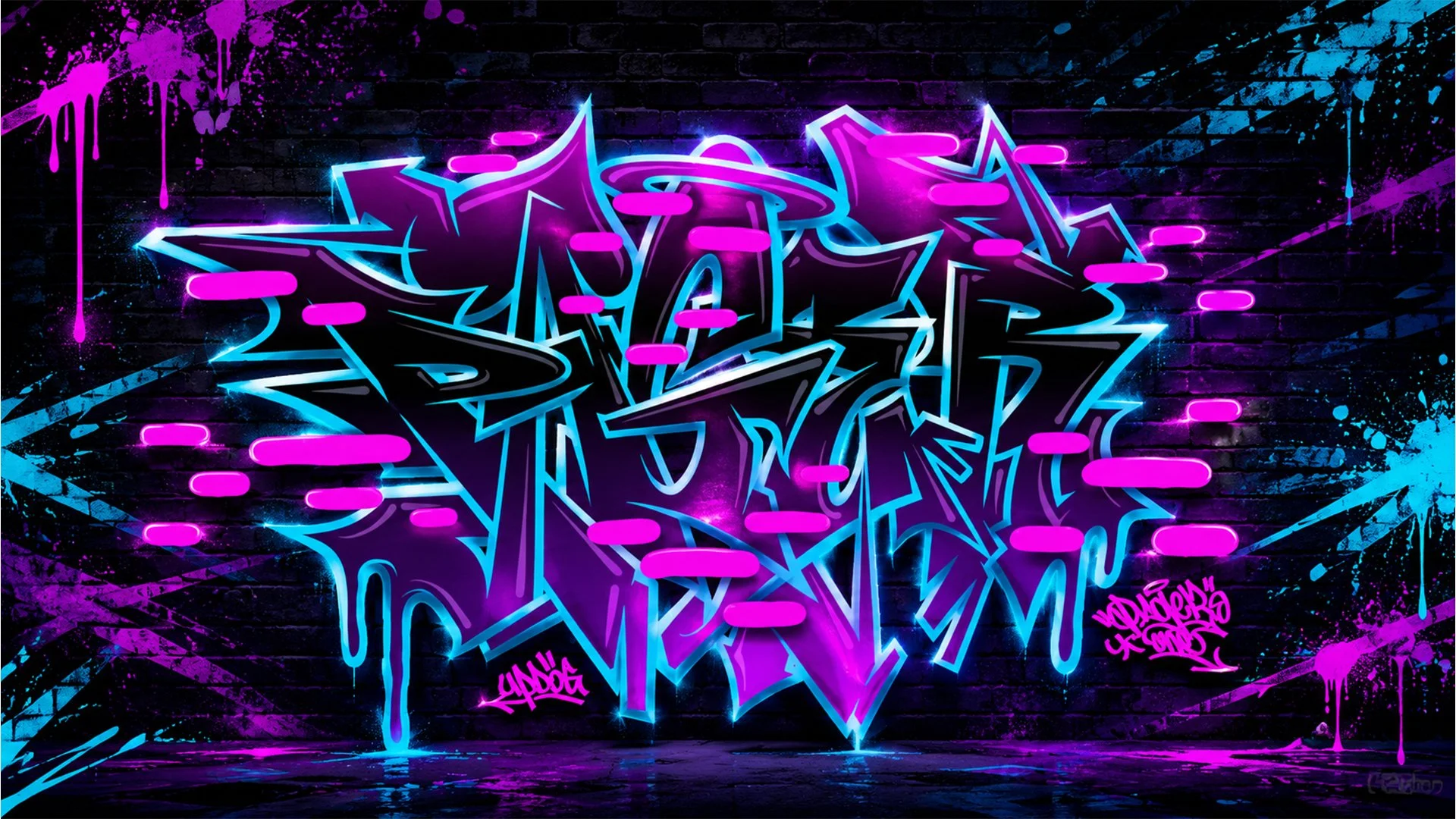
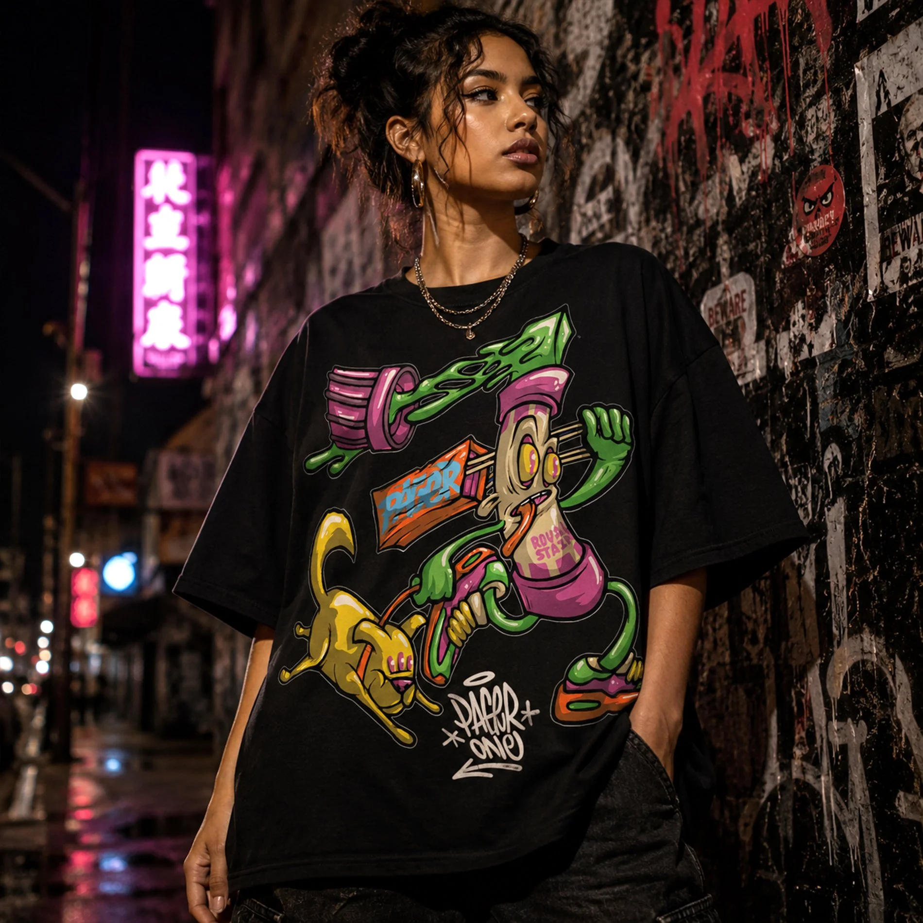
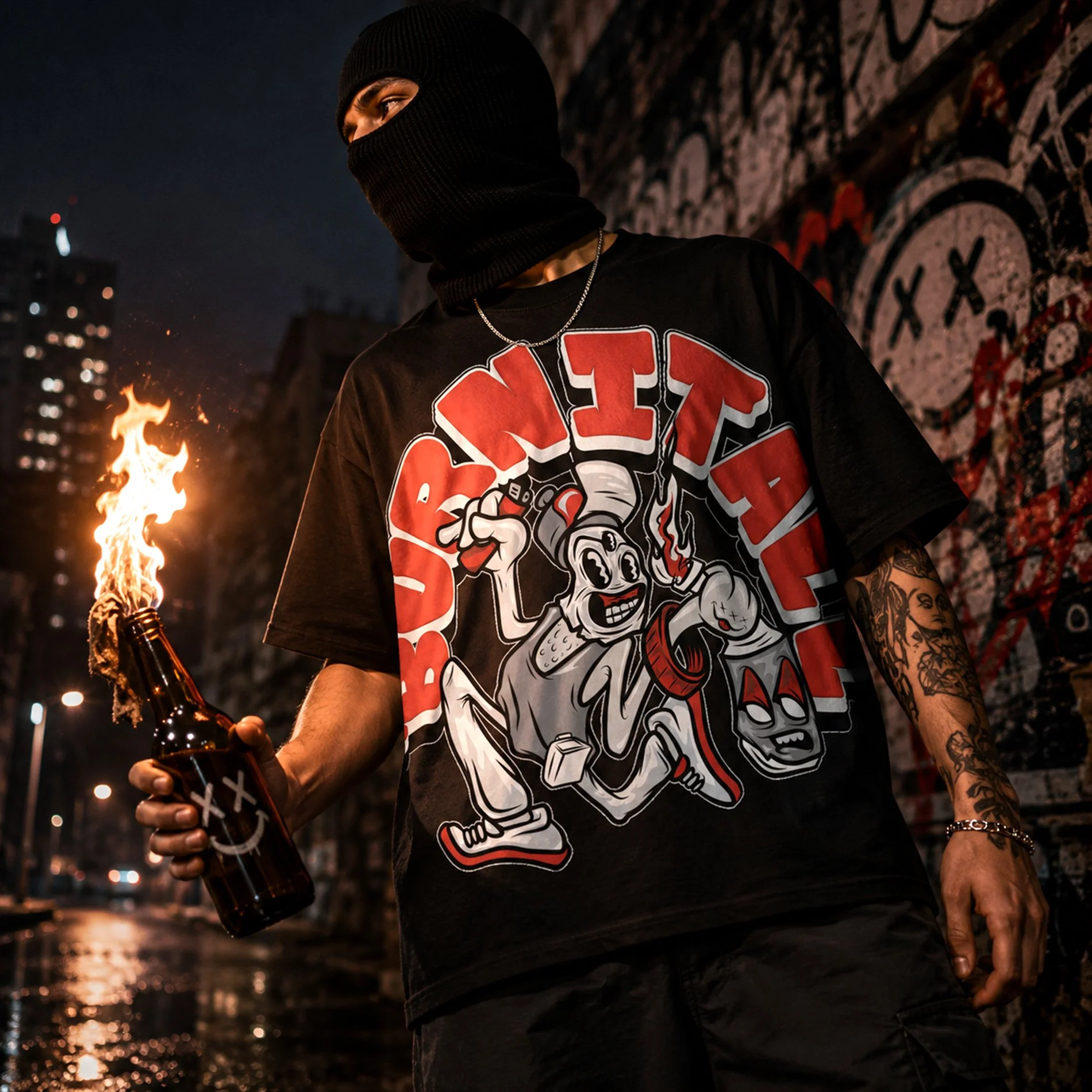
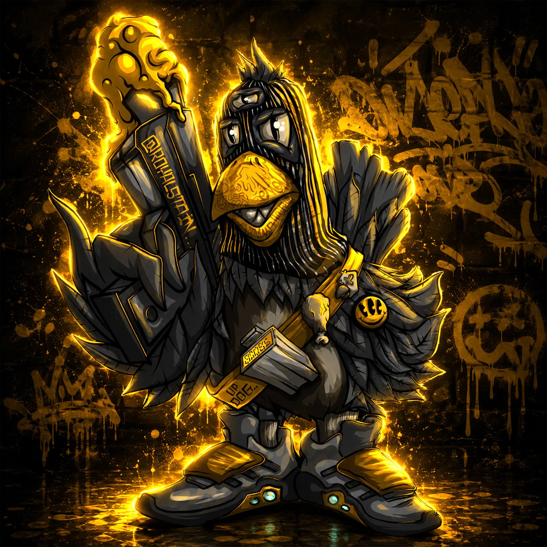
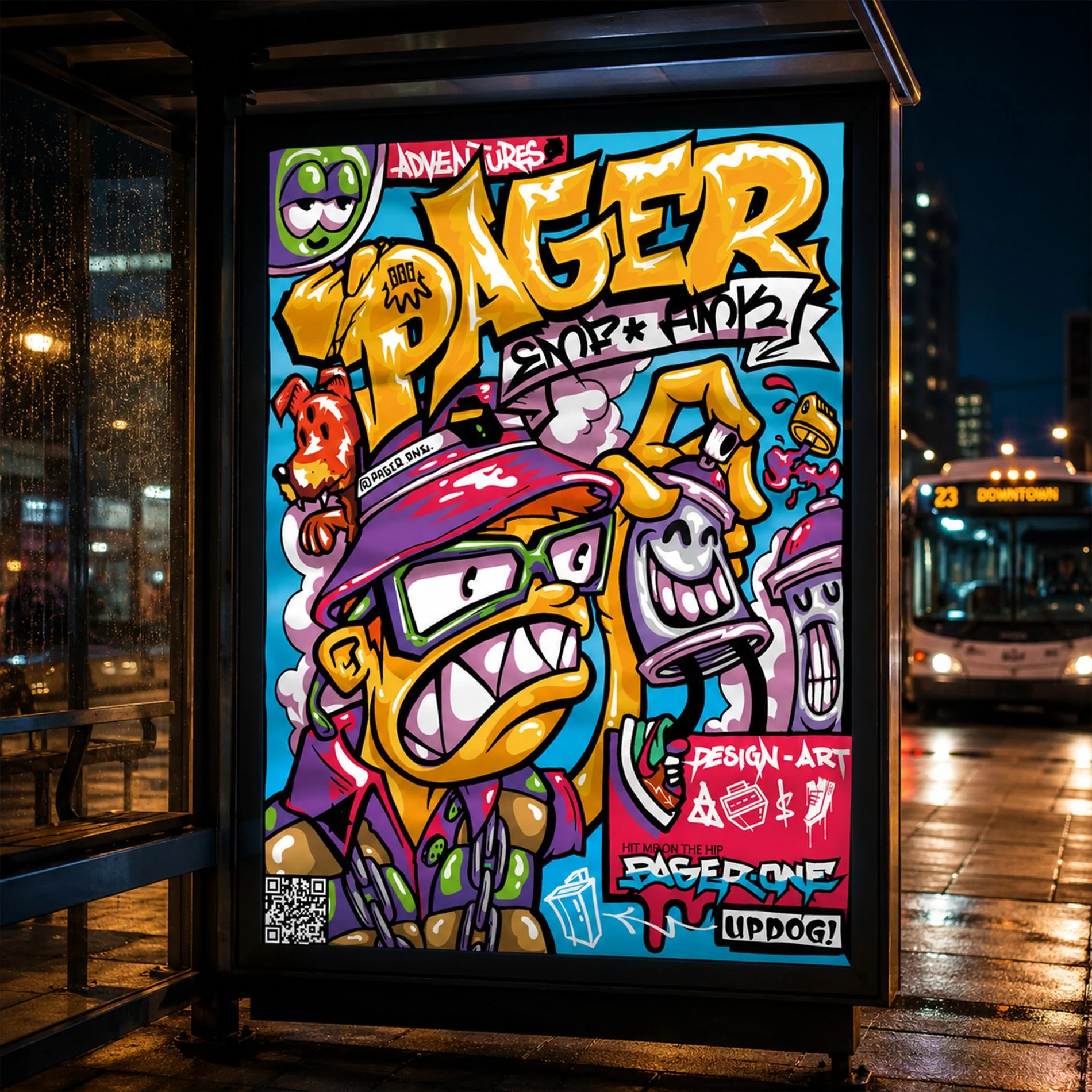
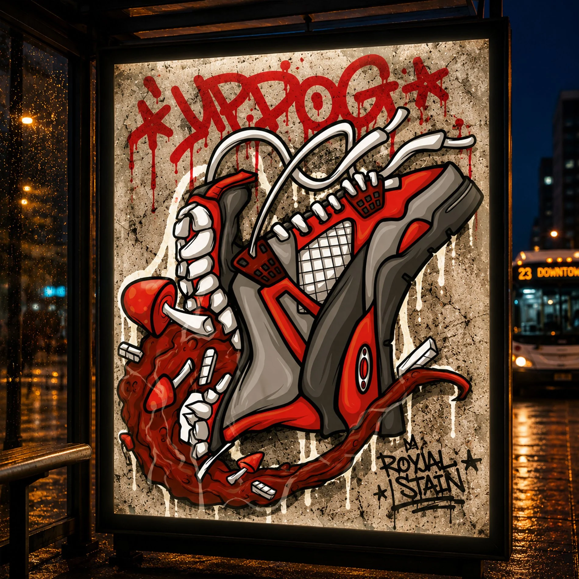
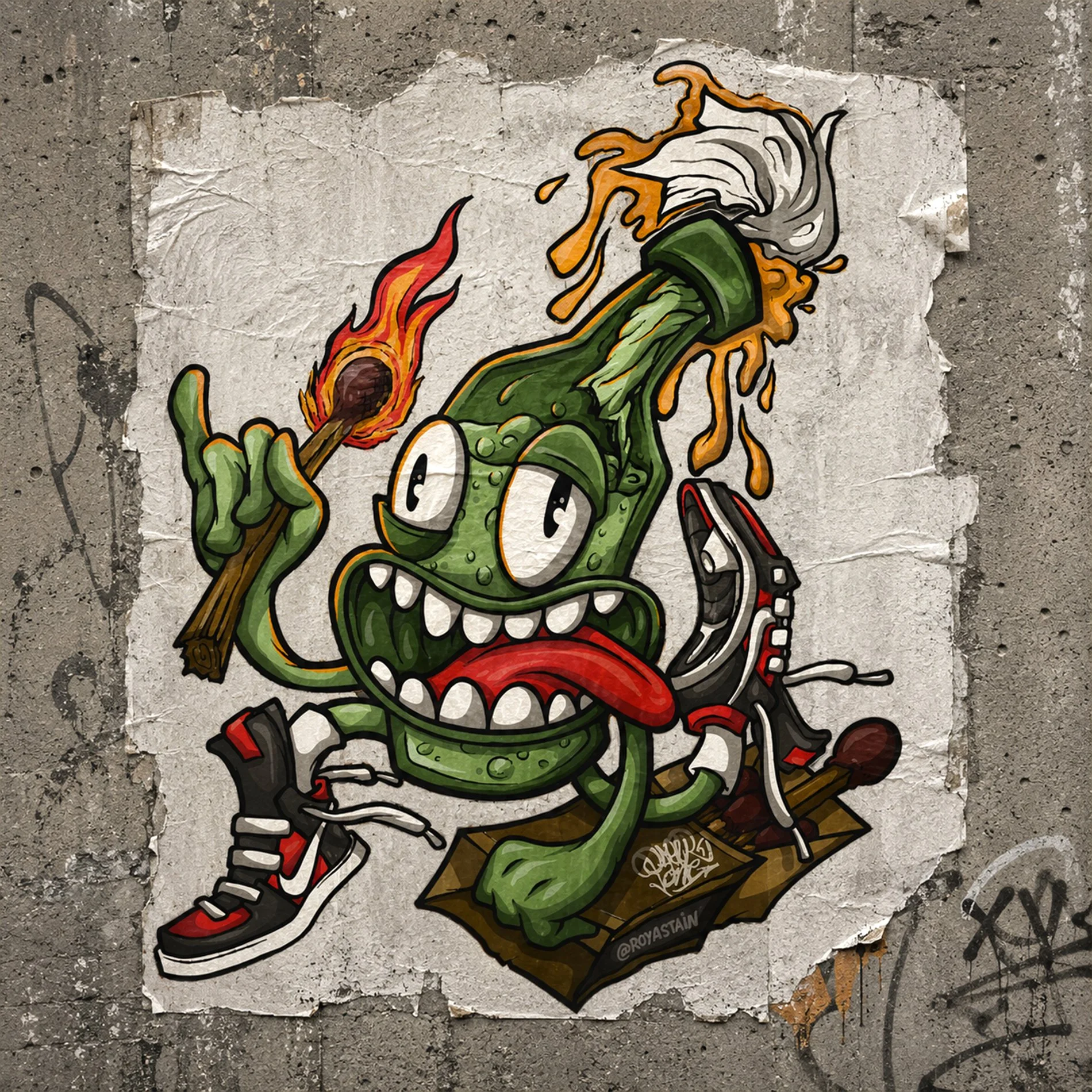
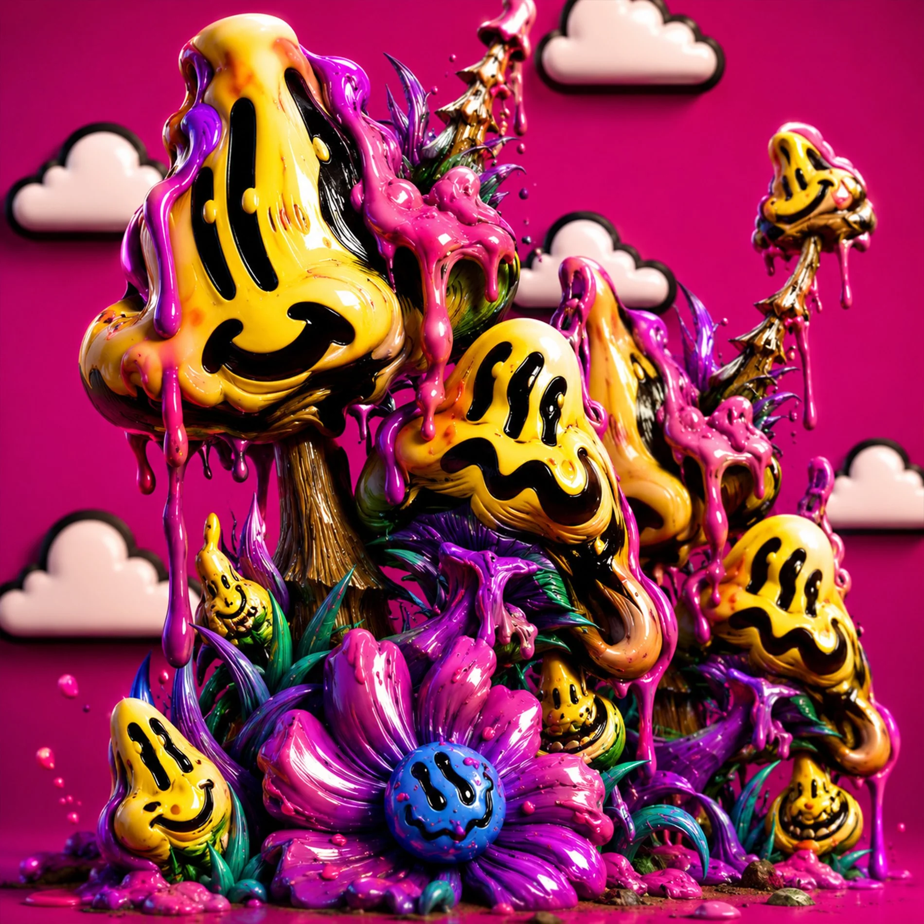
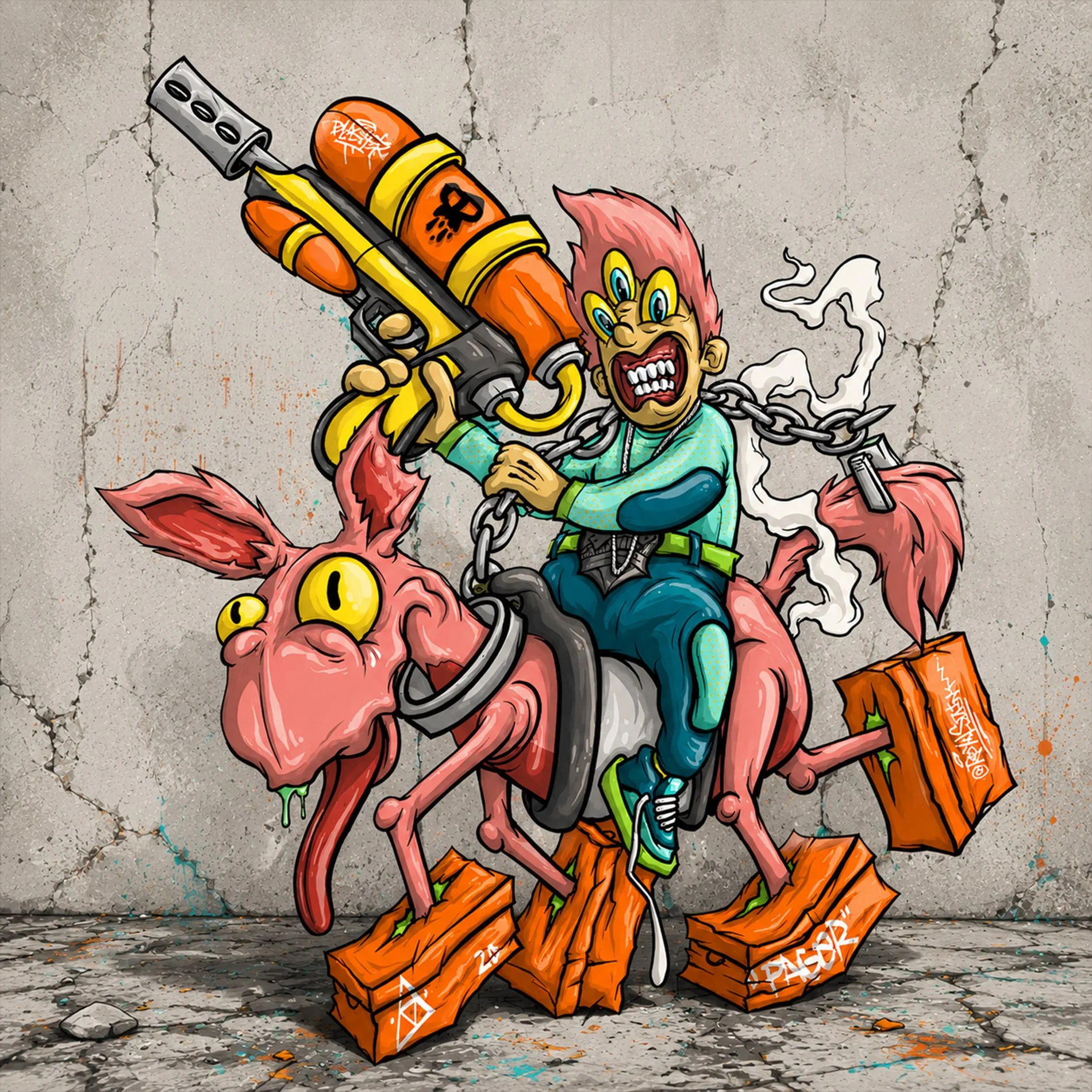
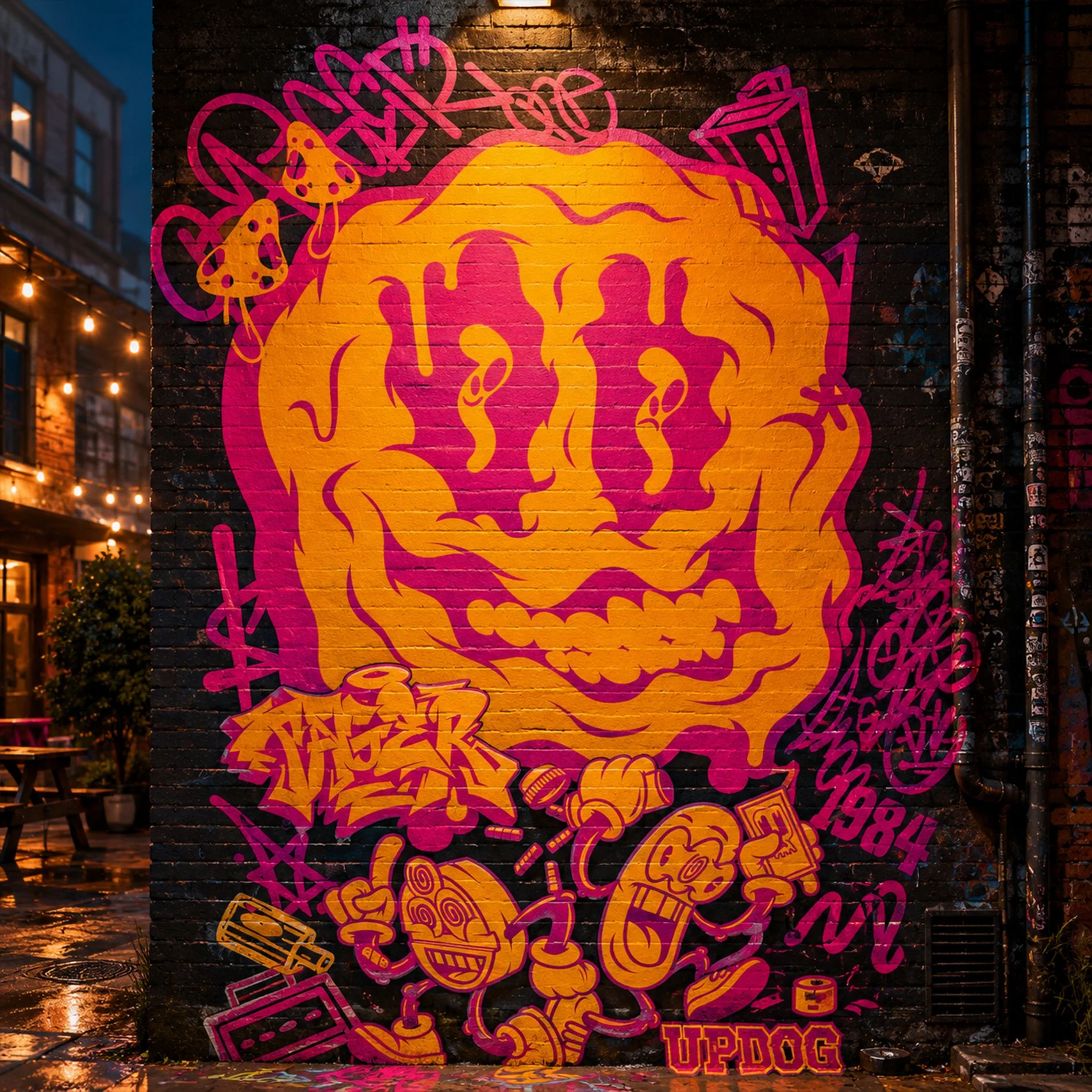
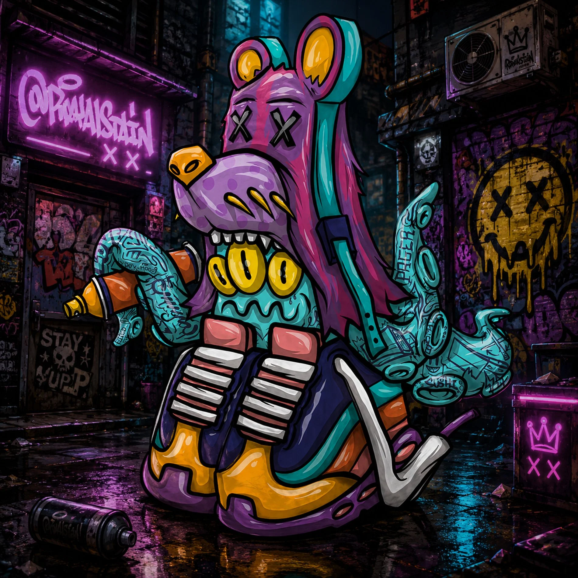
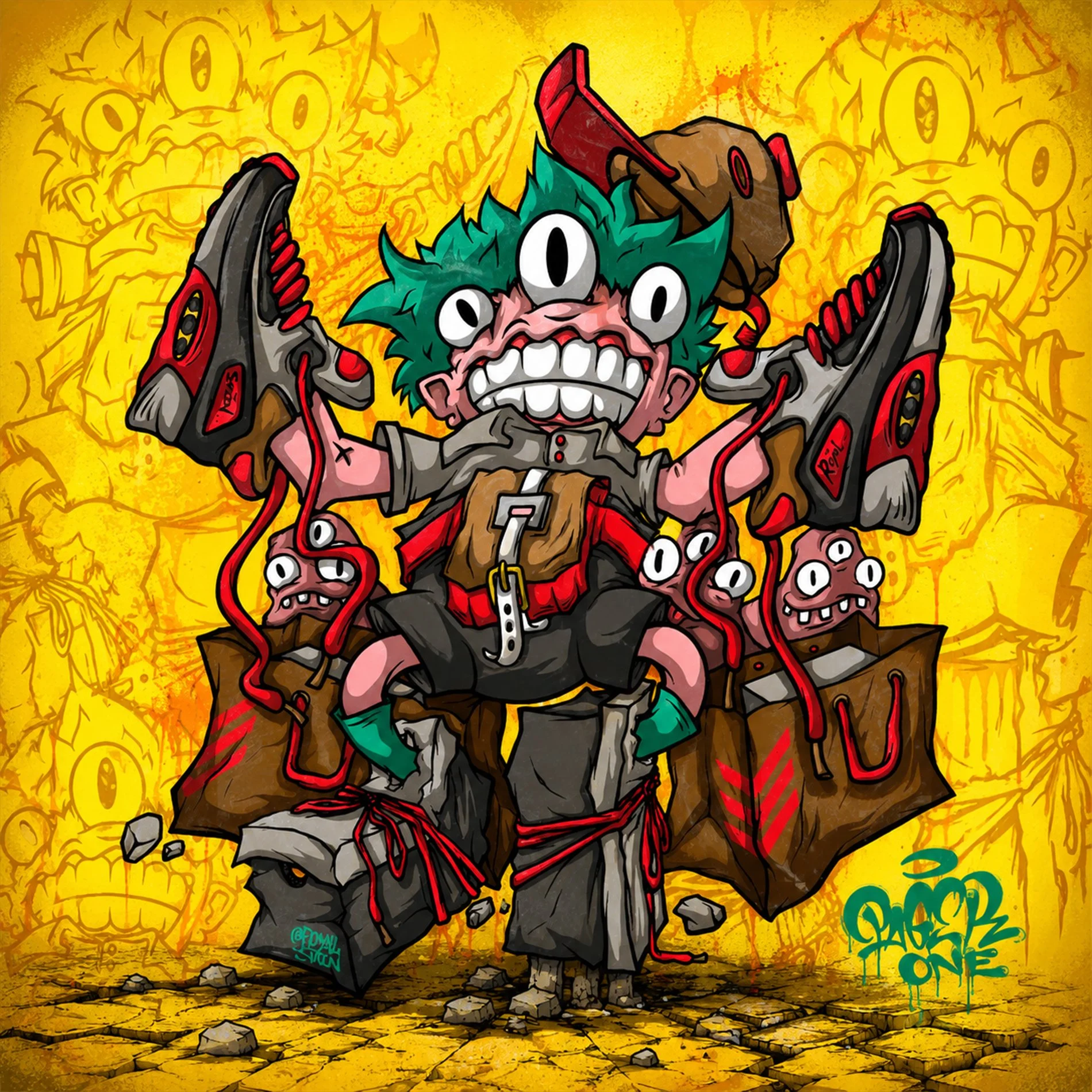
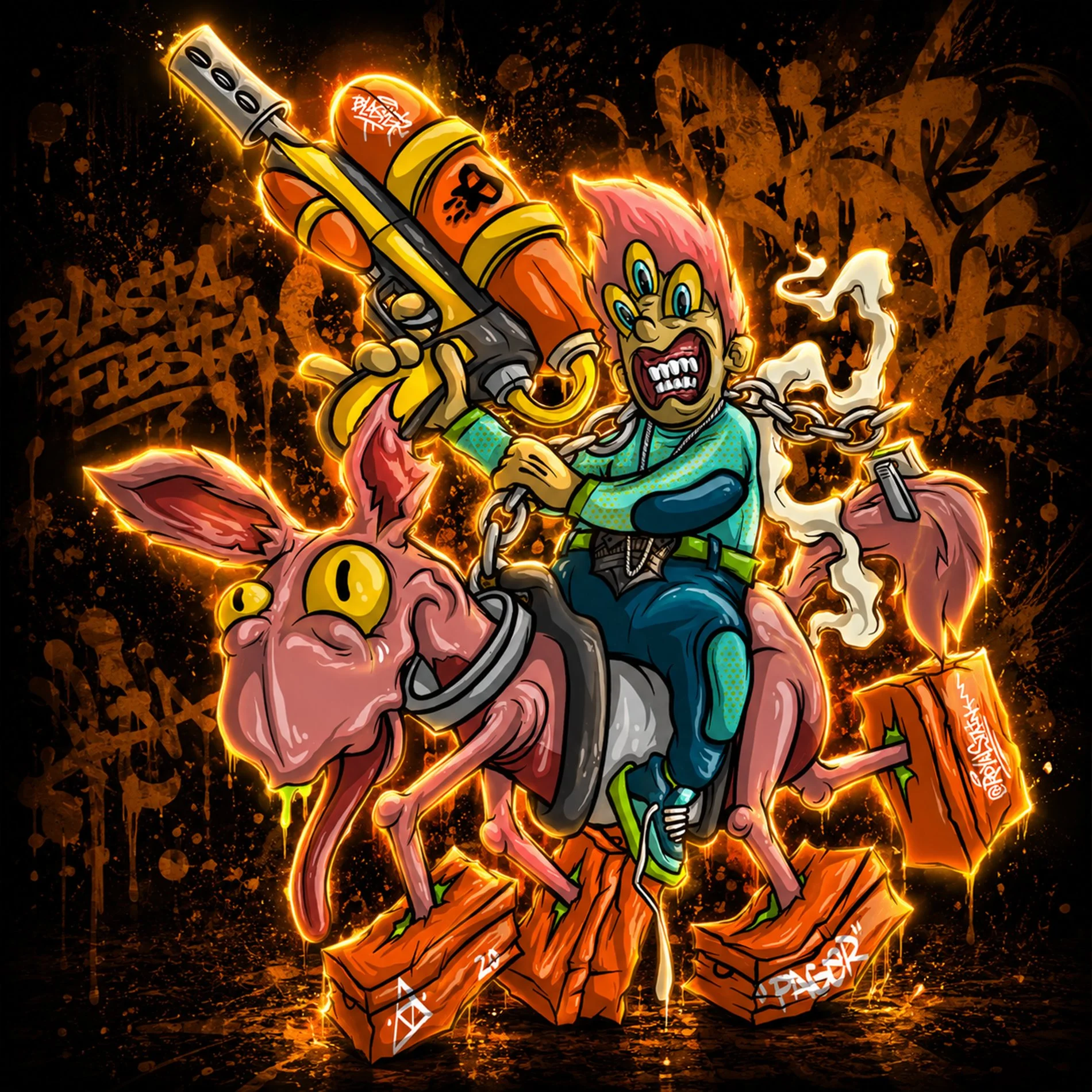
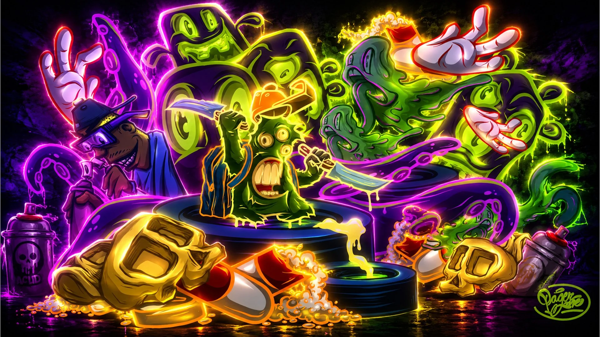
My illustration work is rooted in the belief that great ideas start with real art first. I’m old school in that sense — drawing has always been the foundation of how I think, create, and develop concepts before design ever enters the picture. Whether it’s sketching traditionally, building detailed vector illustrations, or creating more textured raster-based artwork in Procreate, I constantly try to keep my pen sharp and the ideas flowing.
This section showcases a mix of raw drawings, polished vector work, experimental concepts, and digital illustrations that reflect both the artistic side of my process and the creative foundation behind much of the work I build.